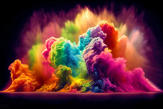
The psychology of colour in printing is a fascinating and important aspect of graphic design and marketing. Colours have the power to evoke emotions, convey messages, and influence people’s perceptions. When you understand the psychology of colour, you can make informed choices in your printed materials to better communicate your message and connect with your target audience.
Here’s a breakdown of how different colours are perceived and their potential effects in printing:
Red: Red is a bold and attention-grabbing colour. It can evoke strong emotions like love, anger, and excitement. In printing, red is often used to convey passion, urgency, or importance.
Blue: Blue is a calming and trust-inspiring colour. It is associated with stability, reliability, and professionalism. Many corporate logos and materials use blue to instil a sense of confidence and credibility.
Yellow: Yellow is a cheerful and optimistic colour. It can symbolize happiness, energy, and warmth. In print, yellow can be used to catch attention and convey a positive and uplifting message.
Green: Green is associated with nature, growth, and freshness. It often represents health, eco-friendliness, and tranquillity. In printing, green is commonly used for environmentally conscious or natural products.
Orange: Orange is a vibrant and energetic colour. It can convey enthusiasm, creativity, and friendliness. It’s often used in promotional materials and calls to action.
Purple: Purple is a colour of luxury, creativity, and sophistication. It can be associated with wisdom and spirituality. In printing, purple can be used to create a sense of elegance and creativity.
Black: Black is often seen as a colour of sophistication, formality, and luxury. It can also represent power and authority. In printing, black is commonly used for text and design elements, especially in high-end products and services.
White: White symbolizes purity, simplicity, and cleanliness. It’s often used to create a minimalist and modern look in printed materials. White space can help make other colours stand out.
Brown: Brown is a warm and earthy colour. It’s often associated with reliability, stability, and a sense of comfort. In printing, brown can be used to create a rustic or vintage feel.
Pink: Pink is often linked to femininity, love, and sweetness. It can also represent youth and playfulness. Pink is commonly used in marketing products and services aimed at women or children.
Gray: Gray is a neutral and conservative colour. It can convey professionalism and timelessness. It’s often used as a background or as a complement to other colours in printed materials.
Keep in mind that cultural and individual differences can influence how people perceive colours. Additionally, the context and combination of colours can significantly impact their psychological effects. Therefore, it’s essential to consider the target audience and the message you want to convey when choosing colours for printing. A well-thought-out colour scheme can enhance the effectiveness of your printed materials and improve the overall visual impact.
See how the expert team at EPM Print Group can assist you and manage the colour combinations for your next project with amazing results. Ask for help right here – https://www.epmprint.com.au/
… [Trackback]
[…] Informations on that Topic: epmprint.com.au/the-psychology-of-colour-in-printing/ […]
… [Trackback]
[…] Find More on that Topic: epmprint.com.au/the-psychology-of-colour-in-printing/ […]
… [Trackback]
[…] Find More Information here on that Topic: epmprint.com.au/the-psychology-of-colour-in-printing/ […]
… [Trackback]
[…] Read More to that Topic: epmprint.com.au/the-psychology-of-colour-in-printing/ […]
… [Trackback]
[…] Read More Information here on that Topic: epmprint.com.au/the-psychology-of-colour-in-printing/ […]
… [Trackback]
[…] Find More on that Topic: epmprint.com.au/the-psychology-of-colour-in-printing/ […]
… [Trackback]
[…] Info on that Topic: epmprint.com.au/the-psychology-of-colour-in-printing/ […]
… [Trackback]
[…] Here you will find 6190 additional Info to that Topic: epmprint.com.au/the-psychology-of-colour-in-printing/ […]
… [Trackback]
[…] Find More on that Topic: epmprint.com.au/the-psychology-of-colour-in-printing/ […]
… [Trackback]
[…] Info on that Topic: epmprint.com.au/the-psychology-of-colour-in-printing/ […]
… [Trackback]
[…] Read More here on that Topic: epmprint.com.au/the-psychology-of-colour-in-printing/ […]
… [Trackback]
[…] Find More on that Topic: epmprint.com.au/the-psychology-of-colour-in-printing/ […]
… [Trackback]
[…] Read More Info here on that Topic: epmprint.com.au/the-psychology-of-colour-in-printing/ […]
… [Trackback]
[…] Read More here on that Topic: epmprint.com.au/the-psychology-of-colour-in-printing/ […]
… [Trackback]
[…] Here you can find 45159 additional Info to that Topic: epmprint.com.au/the-psychology-of-colour-in-printing/ […]
… [Trackback]
[…] Find More on that Topic: epmprint.com.au/the-psychology-of-colour-in-printing/ […]
… [Trackback]
[…] Read More to that Topic: epmprint.com.au/the-psychology-of-colour-in-printing/ […]
… [Trackback]
[…] Information on that Topic: epmprint.com.au/the-psychology-of-colour-in-printing/ […]
… [Trackback]
[…] Read More Information here to that Topic: epmprint.com.au/the-psychology-of-colour-in-printing/ […]
… [Trackback]
[…] Find More on that Topic: epmprint.com.au/the-psychology-of-colour-in-printing/ […]
… [Trackback]
[…] Find More here on that Topic: epmprint.com.au/the-psychology-of-colour-in-printing/ […]
… [Trackback]
[…] Find More on that Topic: epmprint.com.au/the-psychology-of-colour-in-printing/ […]
… [Trackback]
[…] Find More to that Topic: epmprint.com.au/the-psychology-of-colour-in-printing/ […]
… [Trackback]
[…] Find More to that Topic: epmprint.com.au/the-psychology-of-colour-in-printing/ […]
… [Trackback]
[…] Info on that Topic: epmprint.com.au/the-psychology-of-colour-in-printing/ […]
… [Trackback]
[…] Find More here on that Topic: epmprint.com.au/the-psychology-of-colour-in-printing/ […]
… [Trackback]
[…] Info to that Topic: epmprint.com.au/the-psychology-of-colour-in-printing/ […]
… [Trackback]
[…] Find More to that Topic: epmprint.com.au/the-psychology-of-colour-in-printing/ […]
… [Trackback]
[…] Read More on on that Topic: epmprint.com.au/the-psychology-of-colour-in-printing/ […]
… [Trackback]
[…] Read More to that Topic: epmprint.com.au/the-psychology-of-colour-in-printing/ […]
… [Trackback]
[…] Read More to that Topic: epmprint.com.au/the-psychology-of-colour-in-printing/ […]
… [Trackback]
[…] There you can find 90016 additional Information to that Topic: epmprint.com.au/the-psychology-of-colour-in-printing/ […]
… [Trackback]
[…] Find More here on that Topic: epmprint.com.au/the-psychology-of-colour-in-printing/ […]
… [Trackback]
[…] Here you will find 89184 more Information on that Topic: epmprint.com.au/the-psychology-of-colour-in-printing/ […]
… [Trackback]
[…] Find More to that Topic: epmprint.com.au/the-psychology-of-colour-in-printing/ […]
… [Trackback]
[…] Read More Info here to that Topic: epmprint.com.au/the-psychology-of-colour-in-printing/ […]
… [Trackback]
[…] Here you can find 34359 additional Information on that Topic: epmprint.com.au/the-psychology-of-colour-in-printing/ […]
… [Trackback]
[…] There you can find 70545 additional Information to that Topic: epmprint.com.au/the-psychology-of-colour-in-printing/ […]
… [Trackback]
[…] Info to that Topic: epmprint.com.au/the-psychology-of-colour-in-printing/ […]
… [Trackback]
[…] Read More Information here on that Topic: epmprint.com.au/the-psychology-of-colour-in-printing/ […]
… [Trackback]
[…] Read More on that Topic: epmprint.com.au/the-psychology-of-colour-in-printing/ […]
… [Trackback]
[…] Find More Info here to that Topic: epmprint.com.au/the-psychology-of-colour-in-printing/ […]
… [Trackback]
[…] Information on that Topic: epmprint.com.au/the-psychology-of-colour-in-printing/ […]
… [Trackback]
[…] There you can find 76985 additional Info on that Topic: epmprint.com.au/the-psychology-of-colour-in-printing/ […]
… [Trackback]
[…] Info on that Topic: epmprint.com.au/the-psychology-of-colour-in-printing/ […]
… [Trackback]
[…] Find More to that Topic: epmprint.com.au/the-psychology-of-colour-in-printing/ […]
… [Trackback]
[…] Find More Info here to that Topic: epmprint.com.au/the-psychology-of-colour-in-printing/ […]
… [Trackback]
[…] Information to that Topic: epmprint.com.au/the-psychology-of-colour-in-printing/ […]